
WordPress accessibility SEO is one of the highest-leverage moves a freelancer can make. I’ve been building WordPress sites for over 15 years. I’ve probably built over 200 sites and currently manage 100 client sites and until this week, I’d never fully understood ARIA labels or skip links.
I’m writing this because I just found out that accessibility on WordPress is one of the highest-leverage SEO moves a freelancer can make, and I assume that most of us are quietly skipping it without realising.
Table of Contents
A study by Accessibility.Works analysed 10,000 websites. The headline finding: WCAG-compliant sites gained an average 23% more organic traffic and ranked for 27% more keywords than sites that ignored accessibility. The reason makes sense the moment you stop and think about it. As Anne Bovelett put it on the WP Tavern podcast: if assistive technology can’t read your site, search engines probably can’t either.
If you run a WordPress site for yourself or a handful of clients, this is the five-fix checklist I’m rolling out this month. You could ship most of these in an afternoon and get the SEO benefit on the next crawl.
Quick checklist: the 5 WordPress Accessibility SEO fixes
| Fix | Difficulty | Time to ship | SEO impact |
|---|---|---|---|
| Alt text on every image | Easy | 30 mins per site | High |
| Heading hierarchy in order | Easy | 20 mins per page | High |
| Colour contrast at 4.5:1 minimum | Medium | 1-2 hrs per site | Medium |
| Skip links for keyboard users | Easy | 10 mins per site | Low for SEO, high for usability |
| ARIA labels on icon buttons + form fields | Medium | 1 hr per site | High for assistive tech, medium for SEO |
If you only do three: alt text, heading hierarchy, and ARIA labels. Those three carry the weight.
Why accessibility and SEO are the same job
Search engines crawl your site the way assistive technology reads your site. Both rely on the same signals.
- A screen reader announces an image to a blind user using its
altattribute. Google reads the samealtto understand what the image shows. - A keyboard user navigates by heading. Google indexes content by heading.
- A colour-blind user relies on contrast to read text. Google’s Core Web Vitals and content quality scores reward readable, well-structured pages.
- A motor-impaired user benefits from skip links. Google’s bot uses similar markup to skip past site chrome and reach the main content faster.
Every accessibility fix is also a structural signal Google uses to rank pages. The 23% traffic gain in the Accessibility.Works study isn’t magic. It’s the cumulative effect of making the site easier for both humans and machines to read.
That’s why I’d argue this is one of the cheapest SEO wins on the table. You’re not writing new content. You’re not building backlinks. You’re improving the structure of pages you already have so that everything indexes better.
Fix 1: Alt text on every image
This is something a lot of people miss. They upload images and they don’t think about the alt text. There’s people out there who can’t see those images and they rely on it being read out to them, and the alt text does that.
The mistake I see most: keyword stuffing the alt text just to chase a Rank Math green score. Let’s say your focus keyword is “plumbers in Cardiff” and you add a photo to your article. The temptation is to set the alt text to “plumbers in Cardiff” and move on. Rank Math gives you the bonus point, you tick the box. But the photo is actually a plumber fixing a tap, and the alt text should be describing the photo.
What I try to do is combine the two. So instead of “plumbers in Cardiff”, I’ll write “a plumber in Cardiff fixing a tap”. Describes the photo AND includes the keyword without stuffing.
The quick fix if you’ve got hundreds of images with no alt text:
Rank Math (the free version too) has an “Add missing Alt” feature that auto-populates alt text using placeholders. Walkthrough:
- Rank Math dashboard → Image SEO module → enable it
- Rank Math → General Settings → Images (this menu item only appears once Image SEO is enabled)
- Toggle “Add missing Alt”
- Pick a placeholder: filename, site title, site description, current date
Honest caveat: this is a stop-gap, not the answer. The filename might be something unfortunate (“IMG_2304.jpg” reads pretty rough to a screen reader). Really you should go through your images and add relevant alt text manually. But until you get around to it, blanket-enabling this is a quick win.
My rule of thumb: if the image is decorative (a divider, a background pattern), use alt="" so screen readers skip it. If it conveys information, describe what it conveys, and weave the focus keyword in naturally.
Fix 2: Heading hierarchy in order
Honest admission: early on when I was building websites, I didn’t understand this either. A lot of people don’t.
The rule is simple. Every page should have one H1. Two H1s confuses search engines and fails accessibility. H2 is the heading for each section on the page. H3 should only be used to start a subsection inside an H2 section. H4 = subsection inside an H3. It’s a hierarchy, not a styling choice.
It also has to be visually clear. Your H2s should look bigger than your H3s. Not massively, but enough that a sighted user can tell them apart at a glance. If two headings look identical visually but they’re different levels in the markup, that’s confusing for everyone.
The tool I use to audit any page: the Detailed SEO Chrome extension. I use it on my own sites and I use it on competitor sites to see what they’re doing. Click the icon, scroll to “Headings”, and you get the full heading tree of the page. Wrong H5 in the middle of a list of H2s? You’ll see it immediately.
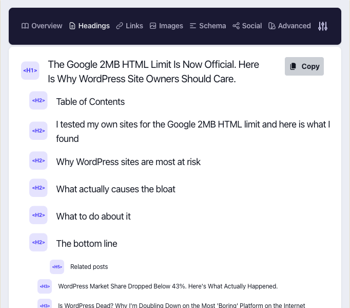
The recent example I caught on my own blog: a section that should have been an H3 was rendered as an H5 because of how the page was laid out. Easy to fix once you can see it.
The Elementor catch: Elementor’s Heading widget often defaults to H2 even on pages that haven’t had an H1 yet. If your theme adds the H1 elsewhere, you can end up with two H1s. Check the widget settings on every section.
My own confession: for a long time I worked with a designer who’d hand me pixel-perfect designs to build. To make sure blog posts and pages looked exactly like the design no matter what heading a client picked in the editor, I’d quietly style H1 through H6 all to look the same. The page looked perfect. The markup was right too – tools like Detailed SEO still saw them as separate heading levels. But visually, you couldn’t tell which one was which. That’s a real accessibility miss, and it’s the kind of thing you only catch by looking at the rendered styling, not the markup.
Fix 3: Colour contrast at 4.5:1 minimum
WCAG recommends a contrast ratio of at least 4.5:1 between text and background for normal-sized text, and 3:1 for large text. Light grey text on white backgrounds is probably the most common failure I see across WordPress themes.
This isn’t optional from an SEO perspective either. Google’s Core Web Vitals and quality scoring penalises pages where users bounce because they can’t read the content. Bounce rate signals translate to ranking penalties over time.
The tool: WebAIM Contrast Checker. Paste your text colour and background hex codes in, get a score. Real numbers from a quick test I ran:
- White text on a yellow brand colour: 1.3:1 (fails badly)
- Dark grey text on the same yellow: 7.52:1 (passes comfortably)
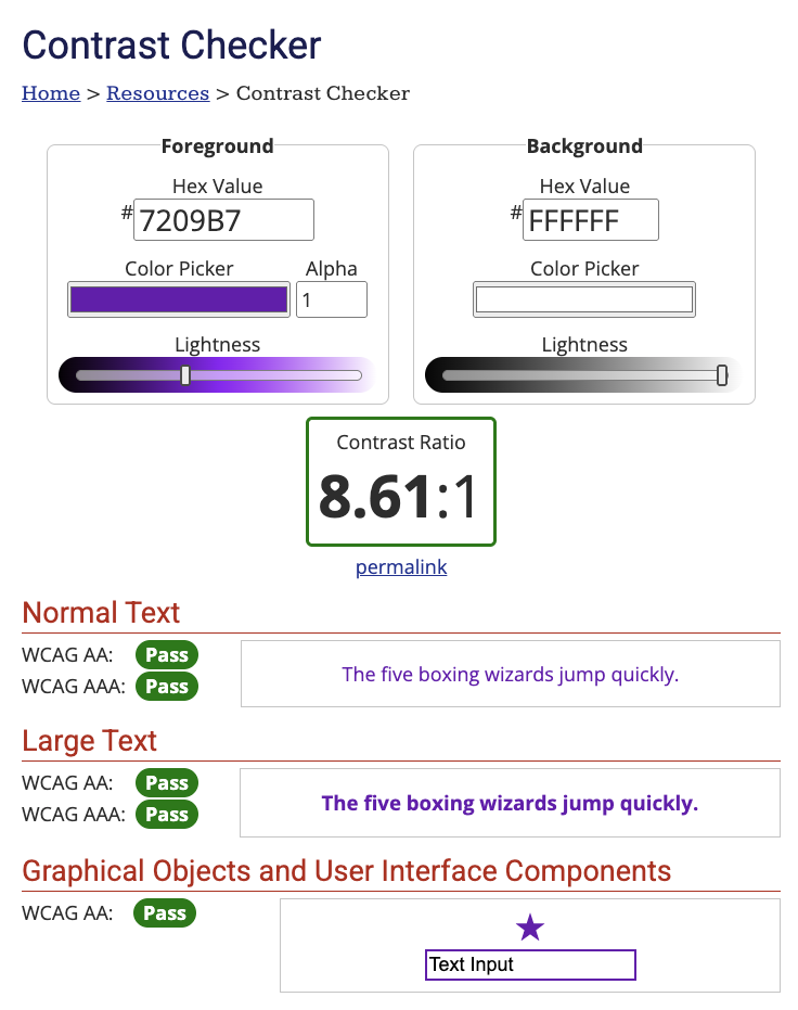
The difference is whether someone with low vision can actually read your site. If the score is below 4.5:1, darken the text or lighten the background. Update the colour values in your theme customiser, Elementor global colours, or your CSS variables.
The font-size accessibility trap most developers miss: a lot of modern WordPress themes (mine included on some sites) use vw sizing for fonts so they scale fluidly with the viewport. It looks great on every device. But when a user hits Cmd+ / Ctrl+ to increase the font size, the text doesn’t grow because it’s pinned to viewport width, not the user’s browser settings. That fails accessibility. If you’re using vw font sizes, you need a fallback that responds to the user’s text-size preferences. Something I’m reviewing across Gecko sites this month.
The agency catch: when clients pick their own brand colours, they often choose a light grey for body text because “it looks softer.” It also fails contrast and tanks readability. Push back politely.
Fix 4: Skip links for keyboard users
A skip link is a single hidden link at the top of every page that lets keyboard users (and screen reader users) jump straight to the main content, bypassing the navigation menu. Without one, every keyboard user has to tab through every menu item on every page they land on.
This is the one I’d skipped for over 15 years. I’d heard the term, never fully understood when to add it.
Honest version: when I’m building a custom theme from a boilerplate or a blank starting point, the skip link markup is sometimes there by default and I’ve quite often removed it because I didn’t know what it was for. I won’t pretend I haven’t. I see it on plenty of WordPress sites I audit too. Test it on any page you’re on right now: press Tab the moment a page loads. If a “Skip to main content” link doesn’t appear, the site doesn’t have one. You only know about it if you need it.
What to do:
- Add a hidden link at the very top of every page that points to your main content area
- The link is visible only when focused via keyboard (Tab key)
- Theme it to match your brand so it doesn’t look like a debug element when it appears
Code for a custom theme:
In your header.php (or wherever your opening tag lives), add a link element as the very first thing inside . Give it:
- A class of
wpo-skip-link(or whatever you want, just keep it custom and not a WordPress core class likescreen-reader-text) - An
hrefof#primary(or whatever ID your main content wrapper uses) - Link text of “Skip to content”
Then add the CSS below to your stylesheet. The first rule pulls the link off-screen by default. The :focus rule pulls it back on screen the moment a keyboard user tabs to it.
.wpo-skip-link {
    position: absolute;
    left: -9999px;
}
.wpo-skip-link:focus {
    position: static;
    background: #000;
    color: #fff;
    padding: 1rem;
    z-index: 100;
}
For Elementor or block theme builds: the WP Accessibility plugin adds skip links automatically without theme code. One install, one activate, done across the whole site.
Fix 5: ARIA labels on icon buttons and form fields
ARIA (Accessible Rich Internet Applications) labels add invisible text to interactive elements that lack a visible label. The places I find them missing on almost every site I audit:
- The Gecko logo at the top of a header that’s clickable as a home link, but has no text on it. Just an image or vector
- Social media icon buttons in the footer (Facebook, X, Instagram icons that are buttons)
- Hamburger menu toggles on mobile (icon-only)
- Search icons in headers
- Form fields where the label is the placeholder rather than a separate
element
A screen reader can’t announce a hamburger menu icon or your logo on its own. Without an aria-label="Open menu" or aria-label="Home" attribute, the user hears something like “button” or “link” with no context.
A subtle one I had to look up myself: ARIA labels work on actual What to do: Code example for a hamburger menu: The agency catch: custom Elementor headers and footers built without ARIA labels are everywhere. After 15 years of building this way myself, I know there’s things I should have been doing. If you maintain client sites, this is the most common gap and the fastest to fix. A short stack that does the heavy lifting: Across 100 client sites you can’t manually check every page. The realistic process I’m using: That’s how I’m rolling this out across Gecko client sites this month. A few honest caveats so you don’t over-promise to clients. This isn’t full WCAG compliance. WCAG has hundreds of criteria. What I’m covering here are the five biggest hitters that affect SEO and basic usability. Sites with legal accessibility obligations (public sector, large eCommerce) probably need a deeper audit by an accessibility specialist. You won’t see a 23% traffic jump overnight. The Accessibility.Works study tracked sites over time, not before-and-after weeks. The gains compound as Google re-crawls and as user behaviour signals improve. Plan to see results over months, not days. Plugins don’t solve everything. The WP Accessibility plugin and similar tools fix the structural basics. They don’t write your alt text, fix your colour palette, or audit your custom Elementor builds. The actual work is still human. Yes, indirectly but reliably. Search engines use the same structural signals (alt text, heading hierarchy, ARIA labels) that assistive technology uses. Sites that are easier to parse rank better over time. The Accessibility.Works study found 23% organic traffic gains and 27% keyword coverage increases in WCAG-compliant sites compared to non-compliant ones. You can fix the basics manually. Alt text, heading hierarchy and colour contrast are theme- and content-level changes. Skip links and focus outlines are easier to ship via the WP Accessibility plugin than to hand-code on every site. No. Most accessibility fixes are markup changes, not asset additions. They have no measurable impact on page speed. The ones that do (focus outline CSS, skip link CSS) are tiny. Once a quarter for active sites. Whenever you ship a major redesign, before the launch. Monthly is overkill for most agency clients. Most Elementor widgets render valid ARIA attributes by default. The gap is usually in custom-coded sections (Code blocks, custom HTML widgets) where the developer skipped them. Audit those manually. WordPress accessibility is one of the highest-leverage SEO moves a freelancer or agency can make. A study of 10,000 sites found WCAG-compliant sites gain 23% more organic traffic on average. The five fixes that matter most: alt text on every image, clean heading hierarchy, 4.5:1 colour contrast minimum, skip links for keyboard users, and ARIA labels on icon buttons and unlabelled form fields. They take an afternoon per site, don’t require new content, and compound in SEO impact over months. I’ve been building WordPress sites for over 15 years and I’m only doing this properly now. If you’ve been skipping accessibility because it felt like compliance theatre, I’d argue that frame is wrong. It’s SEO work in disguise. I’ll be rolling these out across all 100 Gecko client sites this month. I’ll share what I find on a future live or in the newsletter. and elements. If you’ve built clickable elements as plain
aria-label="Home" to your logo link if it’s icon-onlyaria-label="Open menu" to mobile menu togglesaria-label="Search" to search iconsaria-label="Visit our Facebook page" to social icon links element. ARIA is the fallback, not the first choice.
Tools I use to audit and fix
What this isn’t
Frequently asked questions
Does WordPress accessibility actually help SEO?
Do I need a plugin or can I fix accessibility manually?
What is the difference between an alt attribute and an ARIA label?
alt is specifically for images. ARIA labels are for interactive elements (buttons, links, form fields) that lack a visible text label. Use alt for images. Use aria-label for icon-only buttons and unlabelled form fields.Will fixing accessibility hurt my Core Web Vitals?
How often should I re-audit accessibility on a client site?
Does Elementor support ARIA labels properly?
TL;DR